
Guenther Graphics | Brand Identity – Malatesta CPA
A strong brand identity goes beyond a logo. It brings together the ideas, personality, and values behind a business to create a consistent look that feels intentional and recognizable. For Malatesta CPA, the goal was to build an identity that felt modern and approachable while still communicating the trust, confidence, and professionalism clients expect from an experienced accounting firm.

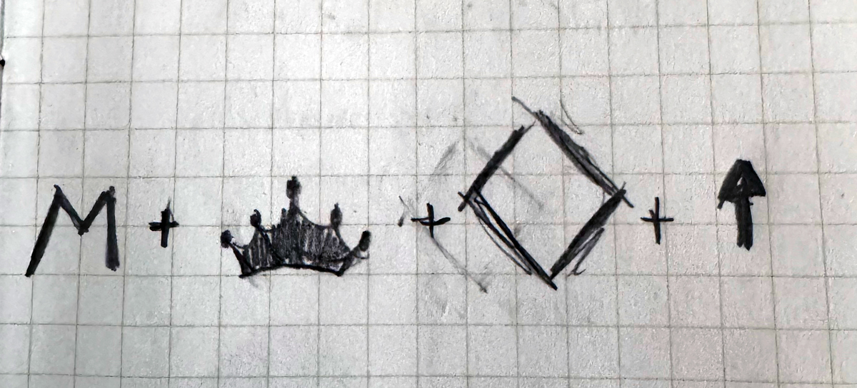
The design centers around the “M” for Malatesta, supported by several visual ideas that reinforce the brand. The crown represents confidence, leadership, and a high level of service, while the diamond shape suggests quality, value, and long-term strength. The upward-pointing form within the mark also creates a subtle sense of growth and forward movement, reflecting the firm’s role in helping clients make smarter decisions and continue moving their businesses in the right direction.
Together, these elements create a bold and recognizable mark that feels established without looking outdated.
Colors
The Malatesta CPA color palette was chosen to support the personality of the brand and the meaning behind the logo. Blue creates a sense of trust and professionalism, while gold adds confidence, quality, and forward movement. Together, they create a polished look that feels established, modern, and approachable.